This article needs additional citations for verification. (February 2011) |

Cover art is a type of artwork presented as an illustration or photograph on the outside of a published product, such as a book (often on a dust jacket), magazine, newspaper (tabloid), comic book, video game (box art), music album (album art), CD, videotape, DVD, or podcast.[1]
The art has a commercial function (i.e., to promote the product it is displayed on), but can also have an aesthetic function, and may be artistically connected to the product (such as with art by, or commissioned by, the creator of the product).[2][3]
Album cover art
[edit]Album cover art is artwork created for a music album. Notable album cover art includes Pink Floyd's The Dark Side of the Moon, King Crimson's In the Court of the Crimson King, Kanye West's My Beautiful Dark Twisted Fantasy,[4][5] the Beatles' Sgt. Pepper's Lonely Hearts Club Band, Abbey Road and their self-titled "White Album", among others. Albums can have cover art created by the musician, as with Joni Mitchell's Clouds,[6] or by an associated musician, such as Bob Dylan's artwork for the cover of Music from Big Pink, by the Band, Dylan's backup band's first album.
Artists known for their album cover art include Alex Steinweiss, an early pioneer in album cover art, Roger Dean, and the Hipgnosis studio. Some album art may cause controversy because of nudity (for example, John Lennon and Yoko Ono's Unfinished Music No. 1: Two Virgins), offending churches, trademark or others.[7] There have been numerous books documenting album cover art, particularly rock and jazz album covers.[8][9][10] Steinweiss was an art director and graphic designer who brought custom artwork to record album covers and invented the first packaging for long-playing records.[7]
Joanne Gair's early album artwork such as David Lee Roth's 1986 Eat 'Em and Smile album cover helped launch her career.[11]
Book cover
[edit]A book cover is usually made up of images (illustrations, photographs, or a combination of both) and text. It usually includes the book title and author and can also include (but not always) a book tagline or quote. The book cover design is usually designed by a graphic designer or book designer, working in-house at a publisher or freelance. Authors can make suggestions for book cover design elements (e.g., a preferred color) but rarely communicate directly with the designer.[12] Once the front cover art has been approved, they will then continue to design the layout of the spine (including the book title, author name and publisher imprint logo) and the back cover (usually including a book blurb and sometimes the barcode and publisher logo). Books can be designed as a set of series or as an individual design. Very commonly, the same book will be designed with a different cover in different countries to suit the specific audience. For example, a cover designed for Australia may have a completely different design in the United Kingdom and again in the United States.
Book covers need to be effective at marketing, which can encourage reliance on stereotypical representations.[12] For example, if the marketing strategy emphasizes that the author is a woman, then the cover might be designed in stereotypical feminine colors such as pink, and if the publisher wants to emphasize that the author is from a particular ethnic background, then the cover might include stereotypical representations of people from that ethnic group.[12]
Book cover art has had books written on the subject.[citation needed] Numerous artists have become noted for their book cover art, including Richard M. Powers and Chip Kidd. In one of the most recognizable book covers in American literature, two sad female eyes (and bright red lips) adrift in the deep blue of a night sky, hover ominously above a skyline that glows like a carnival. Evocative of sorrow and excess, the haunting image has become so inextricably linked to The Great Gatsby that it still adorns the cover of F. Scott Fitzgerald's book 88 years after its debut. The iconic cover art was created by Spanish artist Francis Cugat. With the release of a big Hollywood movie, however, some printings of the book have abandoned the classic cover in favor of one that ties in more closely with the film.[13]
Magazine cover
[edit]Magazine cover artists include Art Spiegelman, who modernized the look of The New Yorker magazine, and his predecessor Rea Irvin, who created the Eustace Tilly character for the magazine. Magazine cover artists who were well known for capturing important political and social issues of the day include Norman Rockwell, whose work appeared 322 times on the cover of The Saturday Evening Post[14] (11 featuring the Willie Gillis character),[15] and Dennis Wheeler, whose 40 covers for Time magazine illustrated social movements and news events of the 1960s and 1970s; seven of them are in the permanent collection of the Museum of Modern Art in New York City.[16][17] Mad magazine has a long history of placing the Alfred E. Neuman character prominently on its cover.[18]
Tabloid cover
[edit]Today, the word tabloid is used as a derogatory descriptor of a style of journalism, rather than its original intent as an indicator of half-broadsheet size. This tends to cloud the fact that the great tabloids were skilfully produced amalgams of human interest stories told with punchy brevity, a clarity drawn from the choice of simple but effective words and often with a dose of wit.[19] The gossipy tabloid scandal sheets, as we know them today, have been around since 1830. That's when Benjamin Day and James Gordon Bennett Sr., the respective publishers of The Sun and the New York Herald, launched what became known as the penny press (whose papers sold for one cent apiece).[20] But some of what is considered the world's best journalism has been tabloid.[21] From the days when John Pilger revealed the truth of Cambodia's Killing Fields in the Daily Mirror, to the stream of revelations that showed the hypocrisy of John Major's "back to basics" cabinet, award-winning writing in the tabloids is acknowledged every year at the National Press Awards.[21]
Good cover art can lead readers to this fact; the New York Herald, for example, offers some examples of tabloid cover art.[22][23] So too does the News & Review, a free weekly published in Nevada and California.[24] The tabloid has thrived since the 1970s, and uses cartoonish cover art.[25] Tabloids have a modern role to play, and along with good cover art (and new ideas) they fill a niche.[26]
Popular music scores (early 20th century)
[edit]Sheet music cover artists include Frederick S. Manning, William Austin Starmer and Frederick Waite Starmer, all three of whom worked for Jerome H. Remick. Other prolific artists included Albert Wilfred Barbelle, André C. De Takacs,[27] and Gene Buck. E. H. Pfeiffer[28] did cover illustrations for Gotham-Attucks; Remick, F.B. Haviland Pub. Co.; Jerome & Schwartz Publishing Company; Lew Berk Music Company; Waterson, Berlin & Snyder, Inc.; and others.
Gallery
[edit]Books
[edit]-
Ivory book cover with scenes from the life of Christ, c. 800 AD
-
Uezdnoe, by Yevgeny Zamyatin, 1916
-
The Real Mother Goose, Blanche Fisher Wright, illustrator, 1916
Newspapers, magazines, comic books
[edit]-
Gentleman Jim Corbett and John L. Sullivan at the Olympic Club, New Orleans, The Times-Democrat, September 8, 1892
-
Billboard's tenth anniversary edition, 1904
-
Vanity Fair, June 1914
-
Skater with scarf, illustrated by Ethel Caroline Rundquist, Vanity Fair, January 1916
-
The Silver Sheet, a studio publication promoting Thomas Ince Productions Bell Boy 13, E. H. Pfeiffer, illustrator, January 1923
-
Pulp magazine Spider, vol. 2, no. 3, April 1934
-
Amazing Man Comics no. 22, illustrated by Paul Gustavson, May 1941
-
LIFE magazine, official U.S. Army photo, June 19, 1944
-
Mister Mystery #1, Key Publications, July–August 1953
-
Broadcast trade magazine, November 2024
Sheet music, recorded music
[edit]-
Sheet music for the Broadway musical, Bandanna Land, Andréa Stephen Chevalier de Takacs, illustrator, Gotham-Attucks, publisher, 1908
-
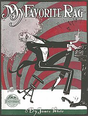
"My Favorite Rag" by James White, illustration by Grim Natwick (one of his earliest published works), 1915
-
Cover for The Beatles' White Album, 1968
-
Cover for Led Zeppelin's promotional single "Stairway to Heaven", 1971
-
Cover for King Crimson's album Three of a Perfect Pair, 1984
-
Cover for Beyoncé's eponymous album, 2013
See also
[edit]- Book cover
- Dust jacket
- History of graphic design
- List of controversial album art
- Video game packaging
References
[edit]- ^ "Home". podcastart.co.
- ^ "Examples @ Pinterest". Archived from the original on 2020-02-17. Retrieved 2017-08-28.
- ^ TED (Mar 31, 2009). "Jacek Utko: Can design save the newspaper?". YouTube. Archived from the original on 2021-11-18.
- ^ Milton, Jamie (2017-11-20). "The best album artwork of the 21st Century so far". NME. Retrieved 2024-01-29.
- ^ Billboard Staff (March 16, 2022). "The 50 Greatest Album Covers of All Time". Billboard. Archived from the original on October 6, 2022. Retrieved January 29, 2024.
- ^ "Clouds". Joni Mitchell. Les Irvin. Retrieved 8 June 2014.
- ^ a b Heller, Steven, "Alex Steinweiss, Originator of Artistic Album Covers, Dies at 94," The New York Times, July 19, 2011
- ^ "The Blues: Album Cover Art", Chronicle Books, 1996
- ^ 1000 Record Covers, Michael Ochs, Taschen Publications, 2005
- ^ Borgerson, Janet; Schroeder, Jonathan E. (2017). Designed for hi-fi living : the vinyl LP in midcentury America. Cambridge, Massachusetts: MIT Press. ISBN 9780262036238. OCLC 958205262.
- ^ Gair, Joanne (2006). Body Painting: Masterpieces by Joanne Gair. Universe Publishing. ISBN 0-7893-1509-2., intro
- ^ a b c Isen, Tajja (2024-08-14). "The Hidden Racism of Book Cover Design | The Walrus". Retrieved 2024-10-14.
- ^ Stamp, Jimmy (May 14, 2013). "When F. Scott Fitzgerald Judged Gatsby By Its Cover". Smithsonian Magazine.
- ^ "Norman Rockewell Biography". The Saturday Evening Post.
Forty-seven years later, Rockwell's work had appeared 322 times on the cover of The Saturday Evening Post — the last, a portrait of John F. Kennedy, appeared in 1963, a week after the president's assassination.
- ^ "Norman Rockwell's Wartime Covers" (Press release). Atwater Kent Museum of Philadelphia. Archived from the original on March 9, 2008. Retrieved April 4, 2008.
- ^ "Wheeler: In the Permanent Collection of the Museum of Modern Art". Joe DiMaggio Photography. July 21, 2016.
- ^ "Dennis Wheeler". Museum of Modern Art.
- ^ Maria Reidelbach. Completely Mad: A History of the Comic Book and Magazine (New York: Little Brown & Company, 1992).
- ^ Day, Mark. (2008, August 21). "For a brighter future, tabloids could look to the past." The Australian, p. 38.
- ^ McLaren, Leah. (2001, August 11). "Admit it: Tabloid culture is what we are" The Globe and Mail, p. L3.
- ^ a b Wynne-Jones, Ros. (2011, July 28). "They've still got news for us." Independent Extra, p. 2.
- ^ C. DeForest Switzer (August 11, 2017). "Cover-Art Credentials". Siouxland Observer.
- ^ "new york Herald cover art". Google.
- ^ "News & Review". 26 March 2020.
- ^ "Chico Issue Archive". Chico News & Review Archives.
- ^ Berlin, Jess S. (2006, November 8). "Cyber tabloid will cover all the news that's virtually true." The Guardian, p. 20.
- ^ "André De Takacs" by Bill Edwards (né William G. Motley; born 1959), ragpiano
.com Website administrator: Bill Edwards (no date); Contributors: Andrea Ellis and Keith Emmons (retrieved February 21, 2020) - ^ "Edward H. Pfeiffer" by Bill Edwards (né William G. Motley; born 1959), ragpiano
.com Website administrator: Bill Edwards (no date)


