-
A 1921 advertisement in The Asahi Shimbun
-
A frame of sorts for traditional Chinese script
This article needs additional citations for verification. (August 2022) |
East Asian typography is the application of typography to the writing systems used for the Chinese, Japanese, Korean, and Vietnamese languages. Scripts represented in East Asian typography include Chinese characters, kana, and hangul.
History
[edit]
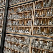
Typesetting with movable type was invented in China during the Song dynasty by Bi Sheng (990–1051). His system used ceramic materials; clay type printing continued to be practiced in China until the Qing dynasty (1644–1912). Wang Zhen (1290–1333) was one of the pioneers of wood type. Although the wooden type was more durable under the mechanical rigors of handling, repeated printing wore the character faces down and the types could be replaced only by carving new pieces.[1]
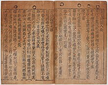
Metal movable type was first invented in Korea c. 1230 during the Goryeo period (918–1392). Hua Sui (1439–1513) introduced bronze type printing to China in 1490. The diffusion of both movable-type systems was limited and the technology did not spread beyond East and Central Asia, however.[2]

Before the 19th century, woodblock printing was favored over movable type to print East Asian text, because movable type required reusable types for thousands of Chinese characters.[3] During the Ming dynasty, Ming typefaces were developed with straight and angular strokes, which made them easier to carve from woodblocks than calligraphic forms such as regular script.[4]
Movable type for Chinese characters was popularized in the mid-19th century by American missionary William Gamble, who led the American Presbyterian Mission Press (APMP) in Ningbo and Shanghai from 1858 to 1869. Gamble developed an electrotyping process to reproduce Chinese character types. This method produced characters that were clearer and more closely resembled calligraphic glyphs, and it allowed the types to be made in smaller sizes without reducing quality.[5][6] In 1869, on his way back to the United States, Gamble stopped over in Japan, where he introduced the electrotype method to Motogi Shōzō.[7] In 1873, Motogi established Tsukiji Type Foundry, the first type foundry in Japan.[3][better source needed] Japanese type foundries invented Gothic typefaces inspired by Latin sans-serif fonts, as well as variations of the Ming typeface. Japanese typefaces influenced type design across China and Japan.[4] Also, the emergence of newspapers in the 19th century made movable type a worthwhile investment.[3]
Following the proclamation of the People's Republic of China in 1949, type designers in mainland China aimed to break free from Japanese stylistic influences by creating typefaces that looked more like handwritten Chinese.[4] Starting in the 1960s, the state-owned Shanghai Printing Technology and Research Institute (SPTRI) developed new typefaces for simplified characters in the four primary type families: Fangsong (or "Imitation Song"), sans-serif Gothic, Ming, and Kaiti. Of these typeface families, the PRC government favored Gothic typefaces because they were plain and "represented a break with the past". The SPTRI was subsequently privatized in the 1990s.[7][better source needed]
Type families
[edit]Ming
[edit]
Ming typefaces (Mincho in Japanese; also known as Song when used with simplified Chinese[8]) are characterized by contrasting vertical and horizontal strokes. Small triangles called uroko (鱗 'fish scales') are nestled into the stroke, and are analogous to serifs in Latin script type.
Gothic
[edit]
East Asian Gothic typeface, known as heiti ('black form') in Chinese, are sans-serif typefaces used with East Asian scripts. They can be further divided into two main types: round sans fonts have rounded ends, while square sans fonts have square ends.[9]
Fangsong
[edit]Fangsong (or "Imitation Song") is a style modeled after that used in Lin'an during the Southern Song dynasty (1127–1279). Fangsong is a class of regular script typeface, and the standard used in official documents produced by the Chinese government,[10] and civil drawings in both China and Taiwan.
Kaiti
[edit]Kaiti typefaces imitate handwritten regular script, as opposed to printed regular script.
Typographic conventions
[edit]Symbols
[edit]Japanese has a set of characteristic punctuation marks; see List of Japanese typographic symbols for more details.[11]
Instead of underlines or cursive, Chinese, Japanese and Korean use emphasis marks.
Ruby text
[edit]Ruby characters are small, annotative glosses that are usually placed above or to the right of Chinese characters to indicate their pronunciation.
See also
[edit]- List of CJK fonts
- Han unification – work to allocate Unicode code points to CJK characters, identifying any that are only stylistically different.
- Horizontal and vertical writing in East Asian scripts
References
[edit]Citations
[edit]- ^ Tsien & Needham (1985), pp. 201–217.
- ^ Ch'on (1993), p. 19.
- ^ a b c Rigaud, Émilie (2 March 2022), "Japanese Typography: Wood to Metal to Light to Vectors", Pangram Pangram Foundry, retrieved 29 August 2022
- ^ a b c Liu (2022).
- ^ Norman, Jeremy M. (23 February 2023), "Missionary Printer William Gamble Introduces Electrotyping to Chinese Printing Type Production", HistoryofInformation.com, retrieved 10 March 2023
- ^ "Biographical Index of Missionaries — China", Presbyterian Heritage Center, 2015, retrieved 10 March 2023
- ^ a b Ng, Brian (6 September 2021), "Revolutionary type: Meet the designer decolonizing Chinese fonts", Rest of World, retrieved 17 September 2022
- ^ Lunde (2008), pp. 23–25.
- ^ "Understanding Japanese Typography", Humble Bunny, 22 August 2011, retrieved 29 August 2022
- ^ 党政机关公文格式 GB/T 9704—2012 (PDF) (in Chinese) – via Shanghai Jiao Tong University
- ^ 日本語資源, nihongoresources.com (in Japanese), retrieved 29 August 2022
Works cited
[edit]- Liu, Yuli (27 October 2022), "Deciphering the Hanzisphere", Sixth Tone, translated by Tse, Katherine, retrieved 10 March 2023
- Tsien, Tsuen-Hsuin; Needham, Joseph, eds. (1985), Paper and Printing, Science and Civilization in China, vol. V:1, Cambridge University Press, ISBN 978-0-521-08690-5
- Ch'on, Hye-bong (1993), "Typography in Korea", Koreana, vol. 7, no. 2, pp. 10–19
- Lunde, Ken (2008), CJKV Information Processing (2nd ed.), O'Reilly, ISBN 978-0-596-51447-1
External links
[edit]- Chinese Type Archive, an open database of Chinese typographical concepts and typefaces


