Voting period is over. Please don't add any new votes. Voting period ends on 20 Sep 2022 at 22:34:55 (UTC)

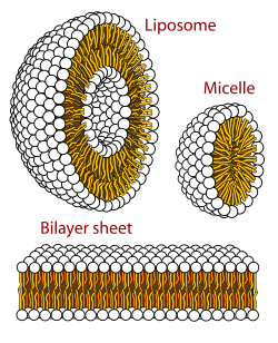
Caption adapted from image caption at Lipid bilayer.
- Reason
- This artwork by LadyofHats provides an incredibly detailed yet concise visualization of the three simplest structures adoptable by phospholipid (bi)layers in an aqueous environment. Phospholipid arrangement is at the foundation of biological study and this image gives a great geometric explanation of why cell and organelle membranes form the structures they do.
- Articles in which this image appears
- Biological membrane, Lipid bilayer, Lipid, Chemical polarity, Micelle, Macromolecular assembly, Lipid polymorphism, Lipid bilayer mechanics.
- FP category for this image
- Diagrams
- Creator
- LadyofHats
- Support as nominator – RFZYNSPY talk 22:34, 10 September 2022 (UTC)
- Leaning to support but I like to see a title (or note) on the image itself, something like "Phospholipids in aqueous solution", to make it more complete as a stand-alone image. Bammesk (talk) 18:14, 11 September 2022 (UTC)
- That's what image captions are for. The advantage of having that sort of text as a caption rather than embedded in the image is that you can adapt the caption to the context rather than forcing the same caption to work for all the different articles the image appears in. Do you demand captions embedded as pixels in the photos nominated here? —David Eppstein (talk) 19:29, 13 September 2022 (UTC)
- Diagrams and sketches aren't photos, so no. But I agree with the adaptive use argument. Bammesk (talk) 00:26, 14 September 2022 (UTC)
- Comment – Niche interest only. – Sca (talk) 12:01, 12 September 2022 (UTC)
- Support This is basic cellular biology. It's the basis for the cell membrane and everything related to it, such as several means of transport into and out of the cell. Adam Cuerden (talk)Has about 8.1% of all FPs 17:56, 12 September 2022 (UTC)
- IMO, cellular biology is a niche subject. -- Sca (talk) 12:06, 13 September 2022 (UTC)
- So are specific bird species and operas. Things taught in high school are less niche. Adam Cuerden (talk)Has about 8.1% of all FPs 17:49, 13 September 2022 (UTC)
- Birds in general are a niche in photography. -- Sca (talk) 12:48, 14 September 2022 (UTC)
- And yet we promote them all the time. Adam Cuerden (talk)Has about 8.1% of all FPs 16:44, 14 September 2022 (UTC)
- Birds in general are a niche in photography. -- Sca (talk) 12:48, 14 September 2022 (UTC)
- So are specific bird species and operas. Things taught in high school are less niche. Adam Cuerden (talk)Has about 8.1% of all FPs 17:49, 13 September 2022 (UTC)
- IMO, cellular biology is a niche subject. -- Sca (talk) 12:06, 13 September 2022 (UTC)
- Support This is basic cellular biology. It's the basis for the cell membrane and everything related to it, such as several means of transport into and out of the cell. Adam Cuerden (talk)Has about 8.1% of all FPs 17:56, 12 September 2022 (UTC)
- Support. We should support encyclopedic and well-rendered diagrammatic content in FPC, not just pretty snapshots of charismatic megafauna and postcard views. This is a high-quality example of this type of image, well illustrates an important distinction in biological membrane structures, and is used prominently to do so in multiple articles (among which Lipid is listed as vital, Lipid bilayer both vital and Good Article, and Micelle is high-importance for biology). It is not easy to make these kinds of images both stylized enough to focus on the important aspects of the topic and to render the three-dimensional shape accurately enough for it to immediately stand out to the reader, and the creator of this image has done an excellent job of exactly that. Of note, it is in a vector rather than raster format, making it more widely reusable (for instance, it would be very easy to change the embedded text, unlike in a photographic image with overlaid and pixelated text). LadyofHats has many good diagrams (I had recent occasion to use File:Wine grape diagram en.svg off-wiki, for instance) and I think we should feature more images like this. —David Eppstein (talk) 19:20, 13 September 2022 (UTC)
- Support – per David and Adam. I like to see more nominations like this as well. Bammesk (talk) 00:26, 14 September 2022 (UTC)
- Support. MER-C 10:40, 18 September 2022 (UTC)
- Support — PerfectSoundWhatever (t; c) 13:08, 18 September 2022 (UTC)
Promoted File:Phospholipids aqueous solution structures.svg --Armbrust The Homunculus 12:54, 21 September 2022 (UTC)